As always, if you haven’t already, head over and join our discord to hear about new Dev Diaries as soon as they go up!
Big Changes!
This month we tackled something that we’ve been struggling with for a while in To The Rescue!. The interaction system. If you’ve tried the game at one of the events we’ve attended then you might remember the 2-handed interaction system we used. Essentially, the idea was that the player had 2 hands that they could use to hold items and interact with the environment independently. We mapped these inputs to the left and right mouse buttons respectively. Interactions were defined by a system of highlights and outlines that you could cycle through with Q & E.
This interaction system was one of the first things that we developed for To The Rescue!. We liked the system but there was definitely a usability issue that we were never quite able to solve. People generally found the system confusing and would rarely take full advantage of it. We could explain how the controls enabled you to carry two items at once but most people still defaulted to only using one hand. As part of our ongoing refactoring push, we decided to take another crack at an interactions system and that’s what I want to talk about today!
An Inventory System !?
The new system is a little more complicated to explain but we think it will be more intuitive to use overall. It’s similar to other games that have a simple inventory system hotbar like Stardew Valley. It consists of 3 parts. The Interaction Marker, Item mode, and Leash mode.
Interaction Marker
Our goal with the Interaction Marker is two fold. Reduce visual clutter and improve interaction clarity. Before, the item currently ‘in focus’ received an outline. This is often layered over or near the current object which received a highlight of some kind. For instance, getting a dog from a kennel looked like this:
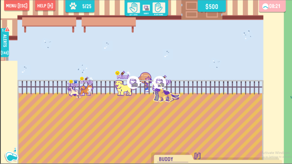
There is a lot going on there! With dogs moving around and icons appearing, the subtle yellow outline isn’t immediately obvious when the player tries to change their focus with Q and E. This led to players repeatedly clicking to get to the desired item. Tedious and unhelpful.
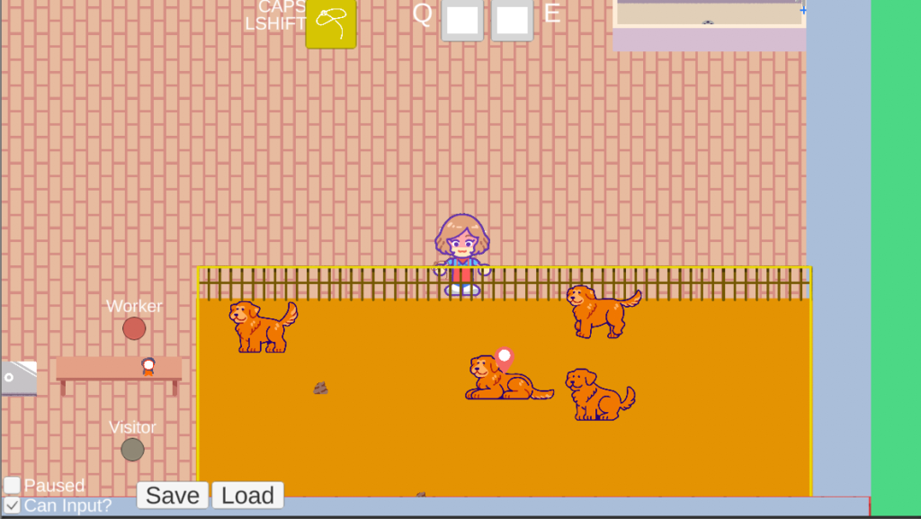
Now, there is an onscreen indicator that only appears when there is a valid interaction. If they player sees that marker, they know something will happen when they click. In addition, when they change focus (now with the Mouse Wheel) the Interaction Marker will move across the screen to the new target!
We feel like the Interaction Marker makes a good foundation for us to expand on and it’s a consistent queue that should tip the player off to a potential interaction.
Item Mode
Item mode is the default method of interacting. This is the main replacement for the 2 handed interaction we used previously. Instead of being limited to their own 2 hands, the caretakers in To The Rescue have discovered they have pockets!
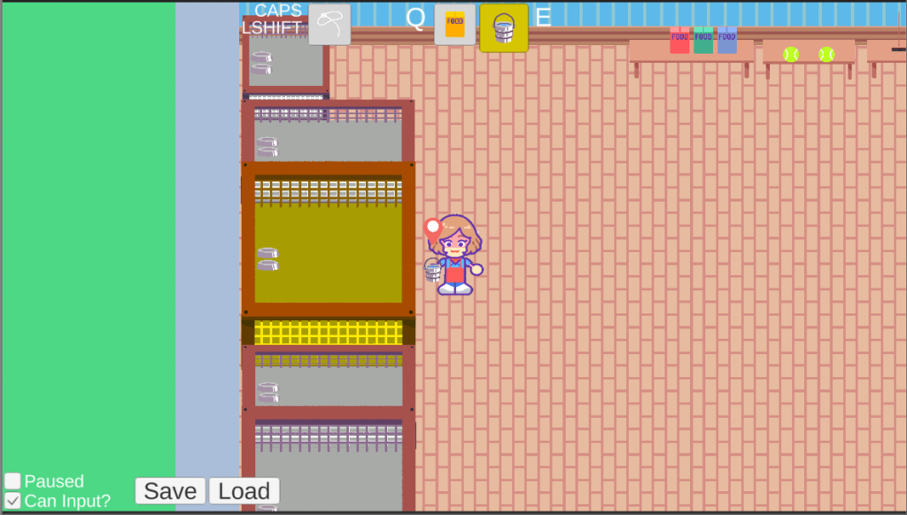
With this exciting new invention, they can bring a few objects with them while they work! Incredible. At the beginning of the game, the player’s inventory will be pretty limited, but if you managed to save up some money, you can buy an upgraded apron with all kinds of snazzy pockets to carry even more Items!
The player will have an inventory wheel at the top-middle part of the screen to show what they currently possess and have equipped. They can cycle through the items in their inventory using Q and E and the left mouse button is Interact/Pickup with the Interaction Marker target. The right mouse button is now Drop. That’s right. Now you can drop items on the floor wherever! Just don’t forget where you left them…
Leash Mode
That’s right. LEASH MODE. One of the most… engaging tasks you undertake in To The Rescue! is wrangling dogs between kennels, baths, and new families. And now with the ability to drop things, dogs can end up running all over the shelter if you aren’t careful!
Rather than making you cycle to a specific item to pickup a dog, you can either hold or toggle into leash mode using hotkeys. Leash Mode instantly equips the Leash Ring, your handy tool to move more than one dog at once, and shifts the Interaction Marker to focus on dog interactions.
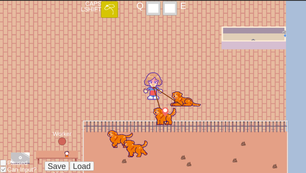
Just like your apron can get more pockets, your Leash Ring can be upgraded too hold even more dogs at once.
Takeaways
It’s quite a bit to write out, but our hope is that these systems will be more intuitive in practice. We’ve compartmentalized Items and Dogs, simplified the controls, and clarified interaction targets with the Interaction Marker. On top of that, the player also has more flexibility in their interactions and can handle even more than they could in the previous system.
And all of this is the result of listening to feedback. It was really hard for us to consider pulling out the old system because it had been there since the beginning, but it consistently failed to resonate with players. Sometimes you have to read the signs and listen to feedback, and make the changes that need to be made.
Let us know what you think of this idea! We’d love to hear your take on the system! In the coming month we will have a lot to show! We’ll be updating our animations, the adoption system, and more!
– Tanner
The updates sound great! The 2-handed system definitely felt a little clunky when I played the demo, but that could be just because it was a new concept to me. I definitely like the sound of the new inventory system though. And POCKETS! Such a wonderful invention. 🙂